Book Rank - Book Recommendation App
Time
2021
Role
Mobie App Design, UX Design, Visual Design, IOS
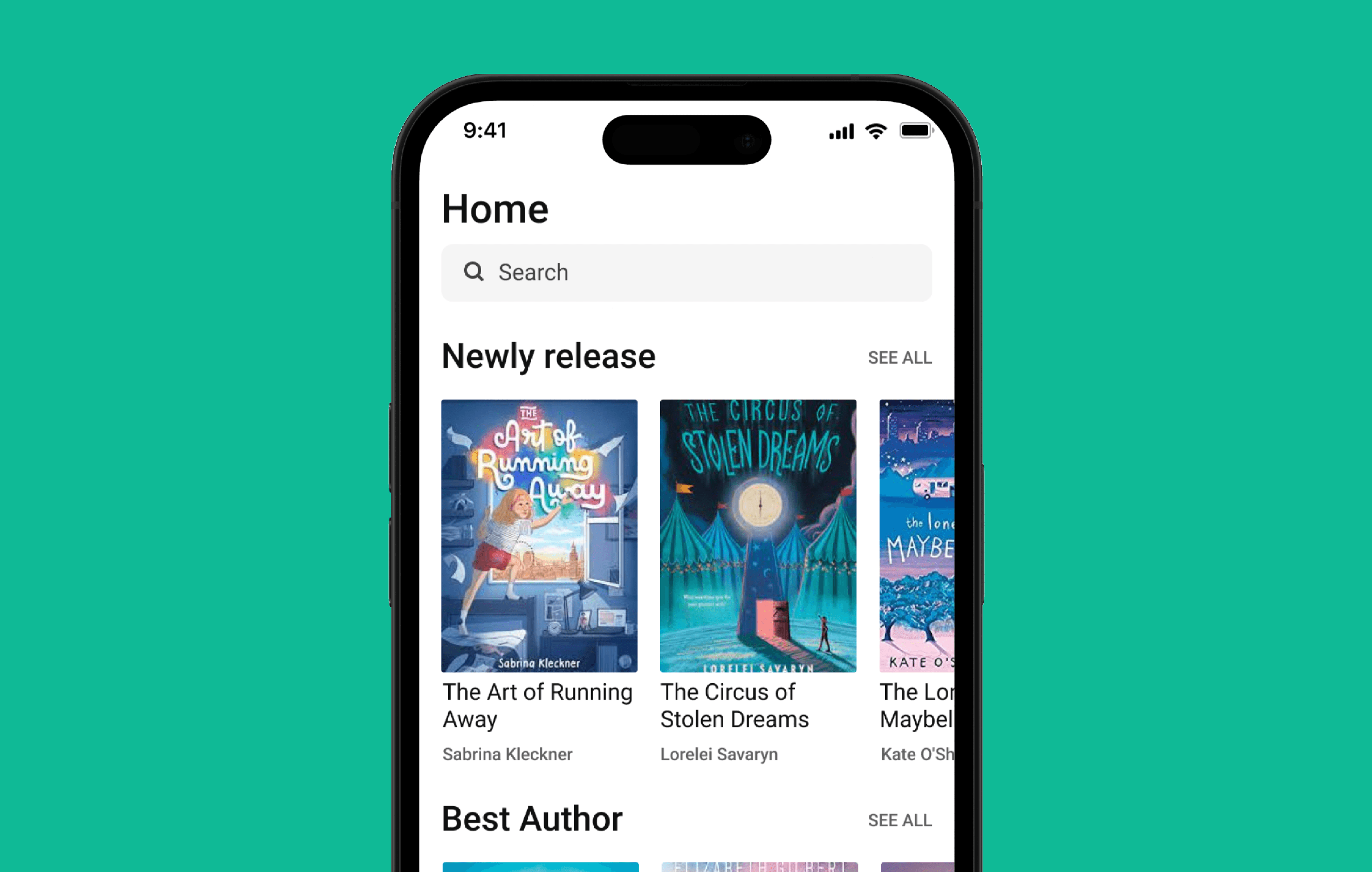
The Book Rank is a mobile app designed to help users quickly check book ratings and reviews before purchasing. Unlike many book-reviewing apps that feel cluttered, this project focused on simplicity and efficiency.

Key Challenges & My Process
Avoiding Feature Overload
Many book-reviewing apps include excessive features that complicate the user experience.
I designed a minimalist and to-the-point interface, allowing users to easily search for books, view ratings, and read reviews without distractions.
Maintaining a Clean & Focused Design
With the goal of highlighting book content, the design needed to be visually simple yet engaging.
I used a limited color palette (green & black) and set clear standards for spacing, typography, and components to ensure a clean and readable UI.